The evolution of the Collins emblem ...
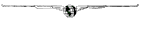 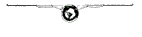 
"Round" 1961 ... "Rockwell" 1973, 1998 The first Collins trademark, used in 1933, was a globe with lines of longitude and latitude and two long, slim wings extending from it. The idea was submitted by a Cedar Rapids firm for a letterhead on the first company stationary. The following year, the same idea reappeared with the grids removed, the globe enlarged and shaded, and wings shortened. By the 1960's, the Collins name was prominently displayed in a redesigned trademark which replaced the wings with straight lines, now referred to as the "winged emblem" in the ads. In 1961, a new trademark was produced by Ken Parkhurst & Associates of Los Angeles. The symbol was patterned after widening circles caused by dropping a pebble into a pond. However, hams referred to this emblem as the rather undignfied "meatball" reference. After the acquisition of Collins by Rockwell International in 1973, the Collins divisions adopted the trademark of the parent corporation. During the transition, S/Line equipment and M-2 as seen in a 1975 brochure did not have an emblem at all. For more information on the Round Emblem transition, please see the 1998 March/April issue of the Collins Journal. |